Hello friends!
Today’s card serves double duty as an entry in Altenew’s June Inspiration Challenge AND an assignment for my Color Your Day course at Altenew Academy.
So my latest class for the Altenew Educator Certification Program – called Color Your Day – was all about color: Which colors to use, how many colors, how to combine colors, etc. It was packed with great tips for finding inspiration and choosing colors for creative projects.
While taking the class, I happened to come across the Altenew Inspiration Challenge for June. I have never participated before and the whole premise is that they provide an inspiration photo and color scheme to get your creative juices flowing – it was exactly what we had talked about in our class!
Here is the photo and color scheme for the June challenge:
Now listen… I am a total pink girl. Or at least summery sherbet colors. I use pink, peach, blush, yellow, etc on almost every card. Ask me to use blue and brown and that is the very definition of “challenge” for me! But this serene image is beautiful and caught my eye so I went for it!
To get started, I stamped out the flower from Marbled Blooms stamp set three times using various Distress Oxide inks. I chose Speckled Egg, Stormy Sky, Faded Jeans, and Chipped Sapphire. For the flower centers I brought in the golden yellow from the inspiration photo and stamped it with Wild Honey and Frayed Burlap distress oxide inks.
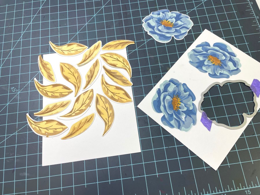
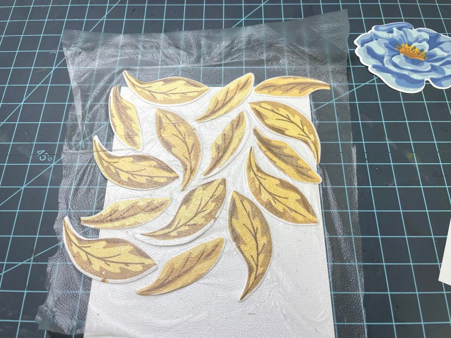
To get more of that yellow color, I stamped both sizes of leaves from the Marbled Blooms set using Scattered Straw, Frayed Burlap, and Gathered Twigs Distress Oxide Inks. I cut out several of the leaves and one of the flowers using the coordinating dies and then arranged my leaves to cover an entire A2 card panel. Once I had them in place, I picked them up with a piece of press ‘n seal wrap to preserve the arrangement.
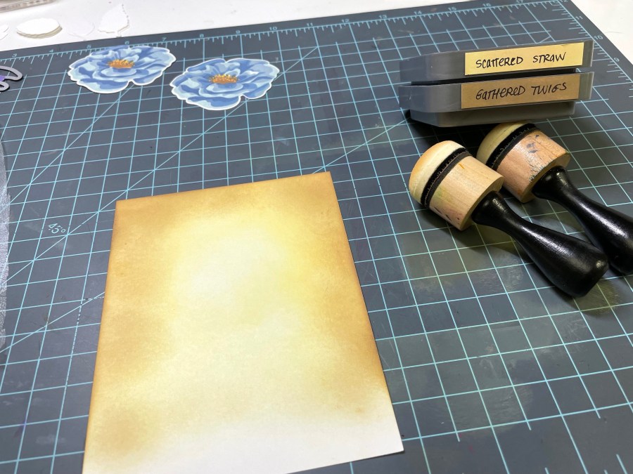
Next I blended the same colors over the card panel, leaving it brighter in the center and darker around the edges. I thought this would make my arrangement of leaves more cohesive with the background.
I applied liquid glue on the back of all my leaves and then laid the arrangement in place to adhere them to the card. I trimmed off any excess and used the trimmed pieces to fill in gaps as needed.
Then I blended the two brown inks over a 1″ strip of cardstock and stamped a greeting that I embossed in white. The greeting came from the Wonderland Stamp set.

This brown strip went right along the bottom of my leaf panel, with the sentiment off to the left, leaving room for me to pop up one of the blue flowers at the bottom right.
I trimmed a little bit off the edges of my panel and mounted it onto another A2 card that I blended with the stormy sky ink to tie in the blue from the flower.
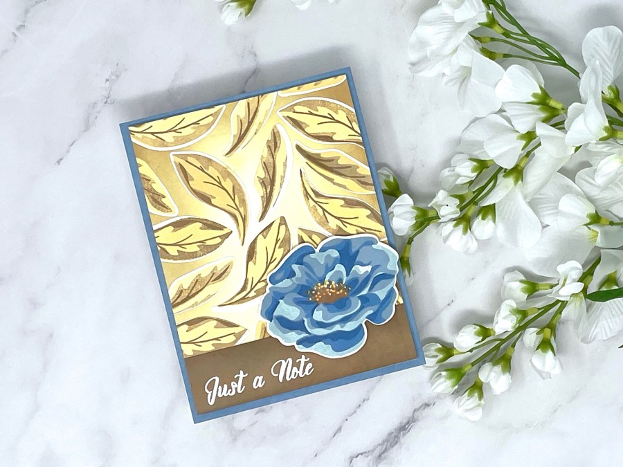
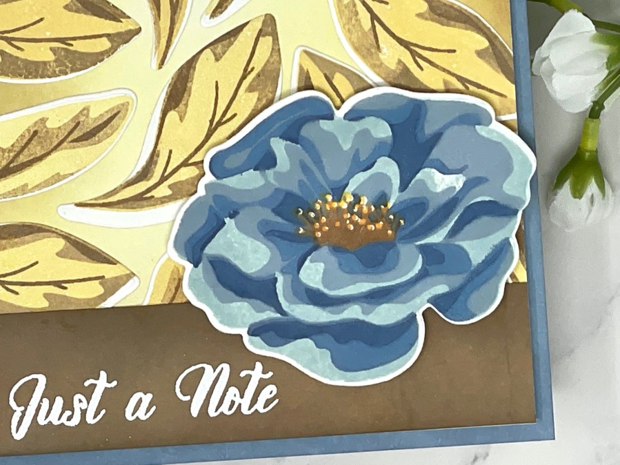
Well, I guess I am a convert – I love this color combo! I loved using the inspiration photo as a starting point and I also used the tip that Therese gave in class about paying attention to the amount of each color and keeping them in the right ratio. I really think it helped me pull this card together successfully!
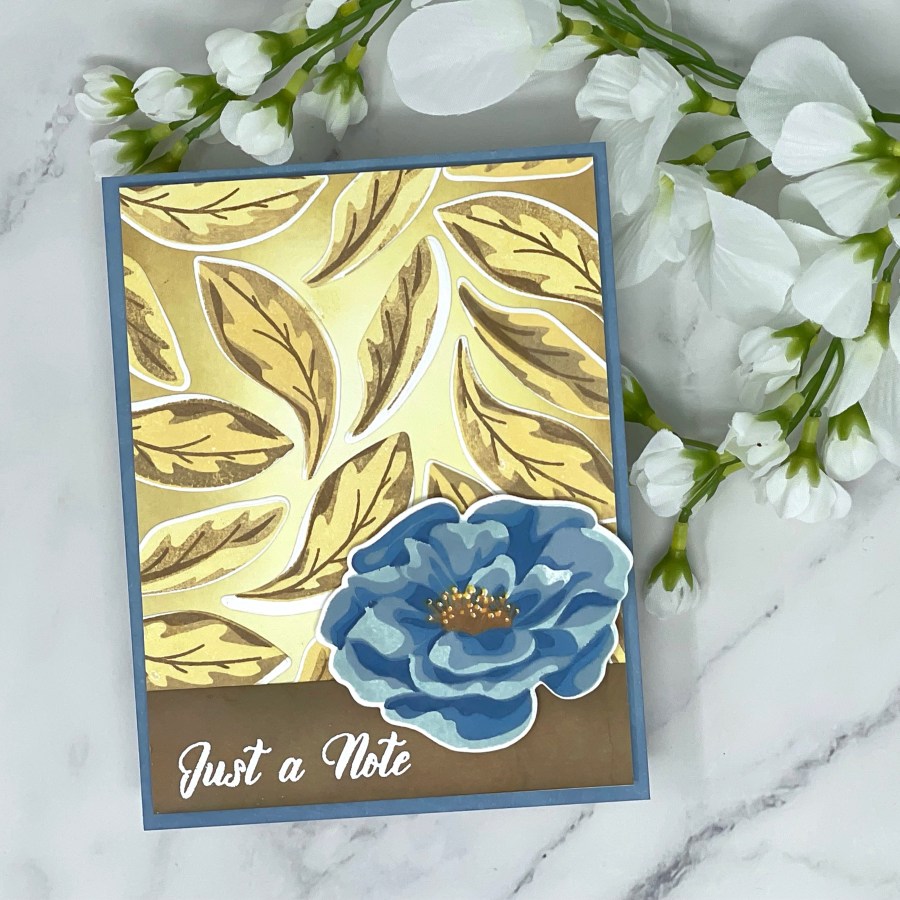
Let me know in the comments if you have any strategy when it comes to choosing colors or if you just go with “what feels right and looks good”! I like a little of both! Also let me know if you’ve participated in any challenges before – I had a ton of fun and I know I’ll be doing it again!
See you soon!
xo,


I really like the colours and how different this card looks! The halo in the background looks wonderful! Thank youf or submitting your gorgeous work to the AECP assignment gallery.